BIG's Serpentine Pavilion
November 2016
By Ione Braddick
The Archio team recently visited the 2016 Serpentine Pavilion, by Bjarke Ingels Group (BIG) and the four Summer Houses, by Asif Khan, Barkow Leibinger, Yona Friedman and Kunlé Adeyami in Hyde Park.
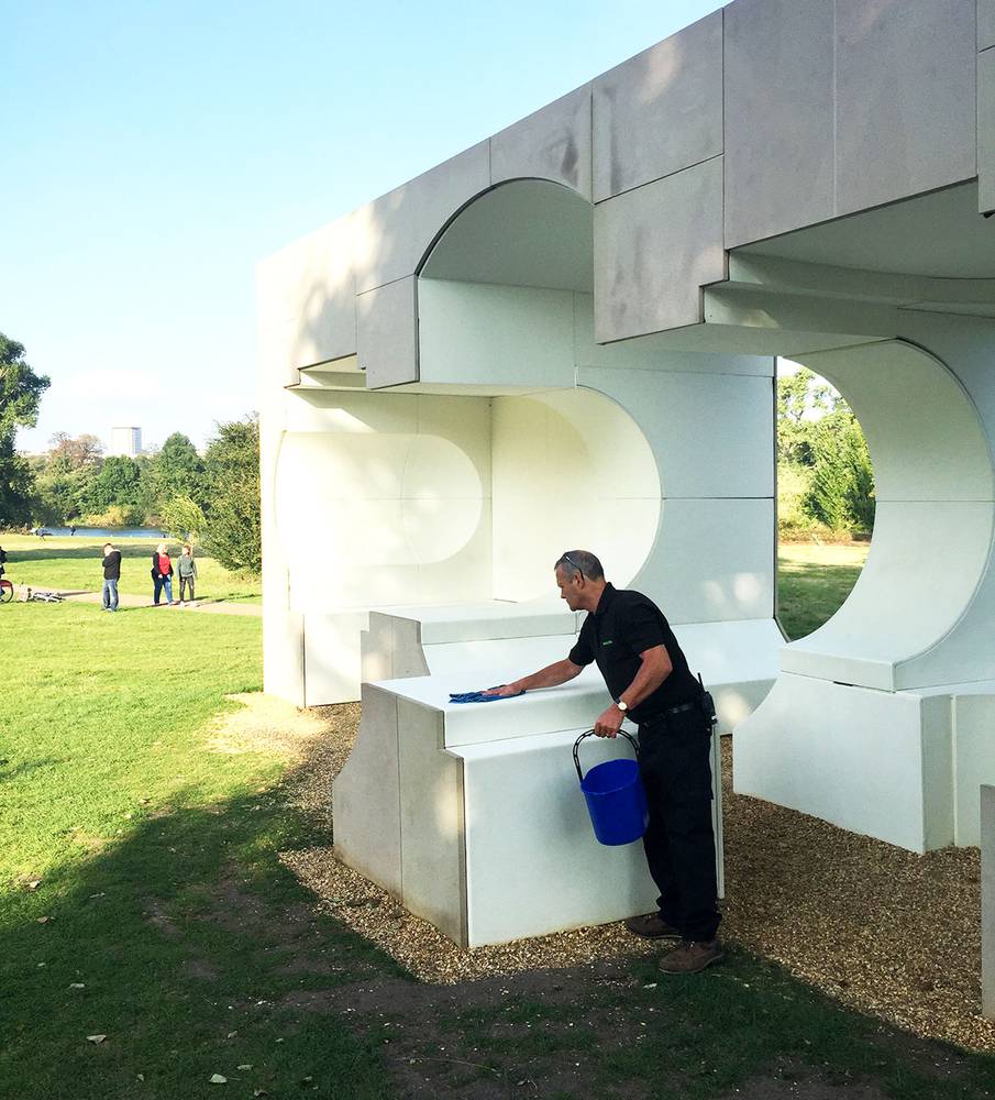
The Summer Houses were a newly-commissioned part of the annual Serpentine Pavilion exhibition, and were the first structures we came across on our visit. In the same vein to the main Serpentine Pavilion, the architects chosen for these summer houses have not completed built projects in the UK. They were based (both physically and conceptually) around Queen Caroline's Temple, a classical summer house built in 1734. Each of the four had a distinct style and concept, with some seemingly more engaging than others, and some having withstood the cold reality of an English summer more robustly.
Whilst debate ensued within the Archio team about the merits and shortcomings of the four, we gravitated towards Adeyami's playful inversion of the Queen Caroline Temple. Whilst the detailing of the summer house could have been neater, the materials and cut-out forms almost insisted on being touched or prodded, with leather reveals and stone cladding. The sculptural reveals appealed as a place to sit and lean, unfortunately an ever-present security guard quickly ushered people off (particularly climbing children) which somewhat dampened the enjoyment of the structure.
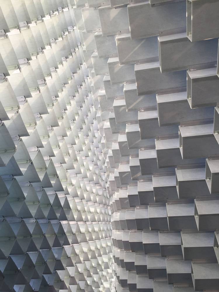
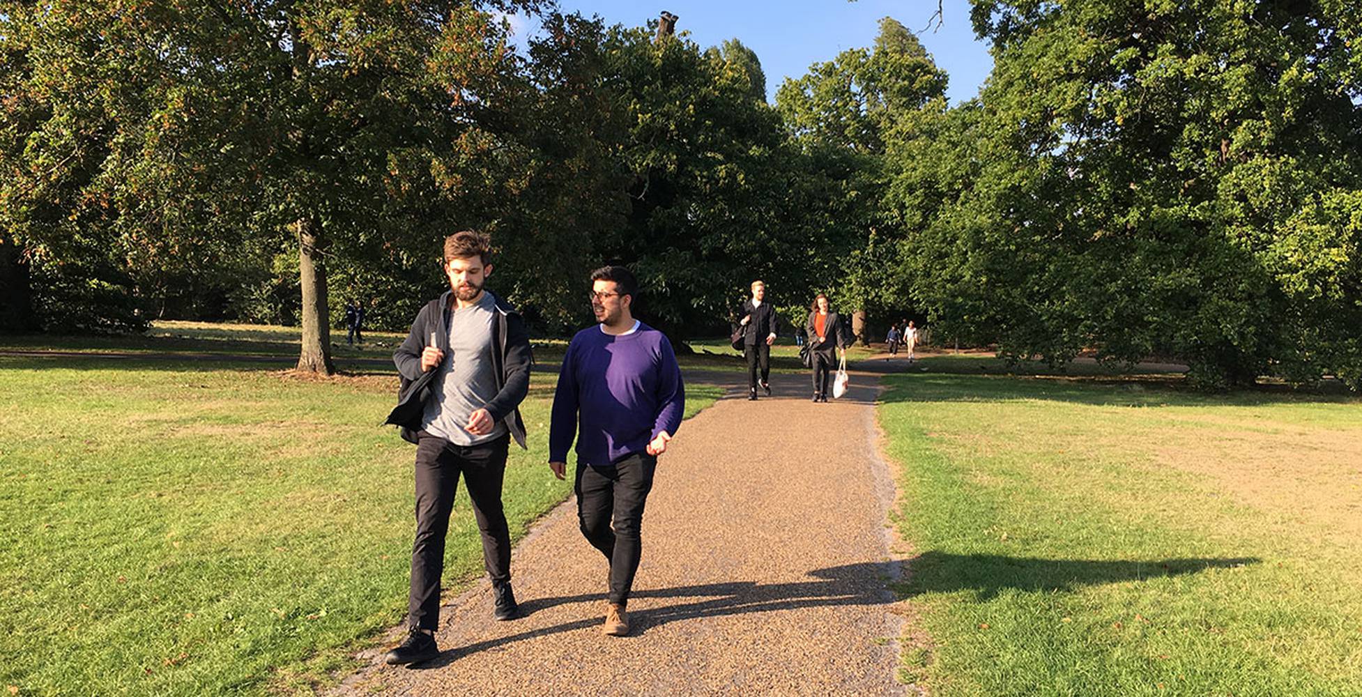
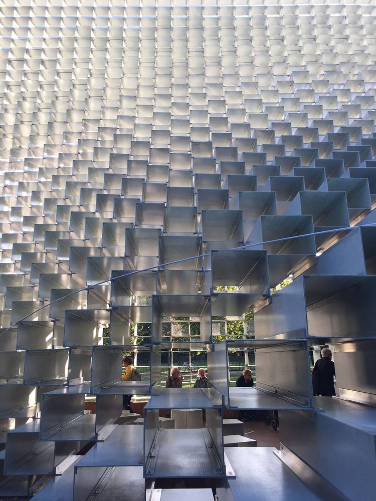
Chased off by the security guard, the Archio team wandered on in the autumn sun to the main event, BIG's Serpentine Pavilion. Entering through the 'unzipped' edge, the pavilion had, as one unnamed Archio member noted "a bit of a Revit look about it..." The steel boxes used for the main structure did seem to extend, repeating, unrealistically above our heads to a pinnacle, as if computer generated. However, as we walked in, the experience of the light and shelter within the structure on an October afternoon was in stark contrast to our preconceptions. The interior, with timber floors folding up into boxes at the edges (matching the external box structure in dimensions) gave the pavilion warmth and functionality as a good place to sit and enjoy the space. We were able to feel connected to the park through views of the leafy surroundings, but sitting in dappled light looking up into the 'zip' of the structure was both impressive and peaceful at the same time.
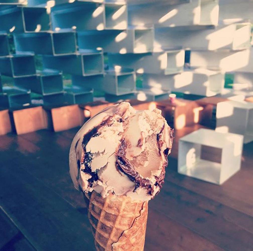
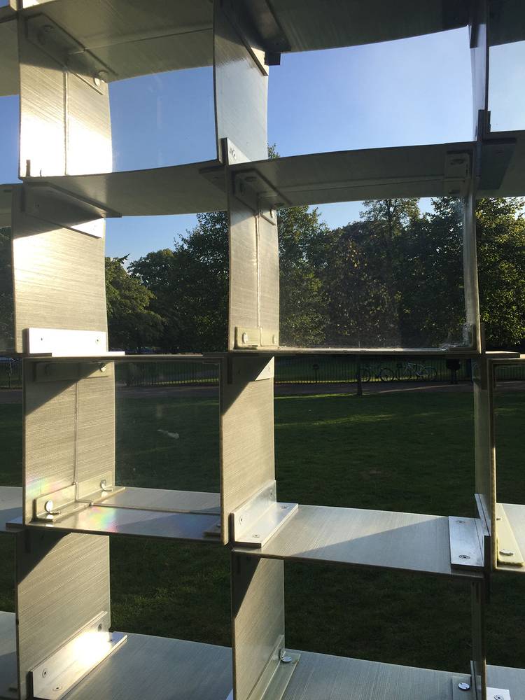
Ice creams were bought from within the pavilion (nutella and honeycomb was the poison of choice) and we strolled around the outside. Perspex squares had been placed diagonally down the pavilion, to add lateral structural support, and it was hard to know if these had been included originally or were a makeshift solution to stop any twisting of the structure once on site.
The pavilion looked far more striking or overbearing from the side elevation, its width again begging to be climbed on. There even seemed to be a handrail placed halfway up... Thwarted again by the pesky security guards, we were told the handrail wasn't a handrail, but a piece that "just came with the building". Ho hum.
Overall it was agreed that BIG's pavilion was actually really rather a lovely place to be inside, in geometrical sunlight, on an October afternoon with an ice cream, but judging by the large cafe umbrellas that had been erected inside, that may not have always been the case. All in all an excellent office afternoon trip, but a note to Serpentine: fewer security guards, more public interaction with materials and structure next time please.
